08 Nov Standard Character Mark vs. Stylized Mark
I often find myself explaining the differences between “word marks” and “design marks” with my clients. There is a great depth of analysis that goes into deciding which type of mark that you need to file for, if not both. In order to better understand the recommendations for the types of applications being suggested, a better understanding of the difference in the types of marks can be greatly beneficial.
The Standard Character Mark (also known as a word mark) is how the USPTO describes a registration for only letters or numbers or any combination thereof. However these marks don’t specify or claim any particular font style, size, color or design element.
In other words, a standard character mark protects alphanumeric characters and the order in which they appear. Capitalization of a Standard Character Mark is immaterial to the protection. In fact, all Standard Character Marks are shown with only capital letters on the registration certificate. Also, all Standard Character Mark Registration Certificates include the following statement: “The mark is presented in standard character format without claim to any particular font style, size or color.”
A good example of Standard Character Mark: “Target” for retail store services.
The stylized logo (also known as a Design Mark or Special Form) is used to register words or letters having a particular stylized appearance or symbols or drawings or a combination of these. In other words, a design mark can protect a logo with or without words.
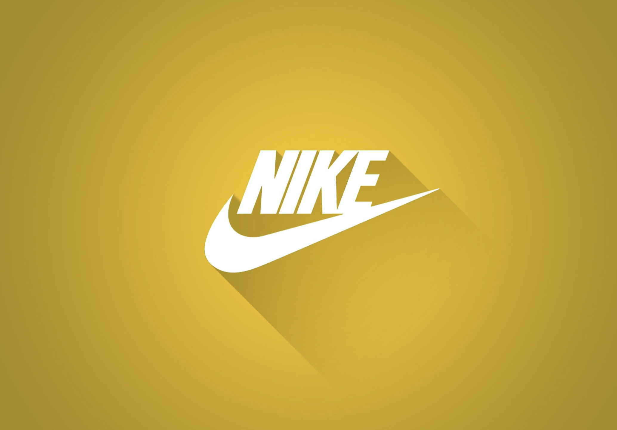
The Nike Swoosh, for example, is a design without words. The same swoosh with “Nike Air” next to it is a design mark with both words and images. The words “Nike Air” in a particular color and font would also be a design mark. When you are filing a Design Mark, you want to take into consideration whether or not you will use the stylized logo or stylized way of writing a name or slogan in any one particular color.
For instance, Target is ALWAYS in red (in their current marketing). If you were filing to protect the word TARGET in the font and style that it is depicted on the store signs, you would also want to claim color, red. Whereas, with Nike, you see the word NIKE in the same font in multiple colors.
I have a pair of shoes where the word NIKE is in metallic rose gold and a shirt where the word NIKE is in black. Therefore, if you were planning to use the mark you are trying to protect in a variety of colors you can choose NOT to claim color as a feature of the mark. When deciding whether to claim color as a feature of the mark, ask yourself: “Is your marketing is directing consumers to associate a particular color with your brand?”
Hint: a Design Mark is something that can’t be recreated with a typewriter, but a Standard Character Mark can be.
Ancient example, I know.
If you are looking for some guidance, let me know.


